| assets | ||
| src | ||
| .editorconfig | ||
| .eslintignore | ||
| .eslintrc | ||
| .gitignore | ||
| esbuild.config.mjs | ||
| LICENSE | ||
| manifest.json | ||
| package-lock.json | ||
| package.json | ||
| README.md | ||
| tsconfig.json | ||

Advanced Canvas for Obsidian.md


⚡ Supercharge your canvas experience! Create presentations, flowcharts and more!
Installation
Open the Community Plugins tab in the settings and search for "Advanced Canvas" (or click here).
Other installation methods
- Install it using BRAT
- Manual folder creation
- Create a folder named
obsidian-advanced-canvasin your vault's plugins folder (<vault>/.obsidian/plugins/). - Download
main.js,styles.cssandmanifest.jsonfrom the latest release and put them in theobsidian-advanced-canvasfolder. - Enable the plugin in Settings -> Community plugins -> Installed plugins
- Create a folder named
Features
All features can be enabled/disabled in the settings.
- Create groups independently of the nodes
- Better default settings
- More canvas commands
- Node Styles
- (Flowchart) Node Shapes
- Terminal shape
- Process shape
- Decision shape
- Input/Output shape
- On-page Reference shape
- Predefined Process shape
- Document shape
- Database shape
- Border Styles
- Dotted
- Dashed
- Invisible
- Text Alignment
- Left
- Center
- Right
- (Flowchart) Node Shapes
- Edge Styles
- Path Styles
- Dotted
- Short-dashed
- Long-dashed
- Arrow Styles
- Triangle Outline
- Halved Triangle
- Thin Triangle
- Diamond
- Diamond Outline
- Circle
- Circle Outline
- Pathfinding Methods
- Default
- Straight
- Square
- A*
- Path Styles
- Add custom styles to nodes and edges for unlimited possibilities
- Custom colors in the color picker
- Properties Support
- Set properties for the canvas file
- Presentation mode
- Create presentations by connecting nodes with arrows
- Portals
- Embed other canvases inside your canvas
- Create edges (arrows) to the embedded canvas
- Collapsible groups
- Collapse and expand groups to organize your canvas
- Auto node resizing
- Resize nodes automatically when the text content changes
- Focus mode
- Focus on a single node and blur all other nodes
- Better readonly
- Disable node popup menus
- Lock the canvas' position
- Lock the canvas' zoom
- Encapsulate selection
- Create a new canvas from the selected nodes
- Create a link to the new canvas in the current canvas
- Expose canvas events to use them in other plugins
- Expose node data to style them using CSS
Support
Please consider supporting the plugin. There are many hours of work and effort behind it. The two easiest ways to support the plugin are either by starring ⭐ the repository or by donating any amount on Ko-fi ❤️. Thank you!
Better Default Settings
- Enforce all new nodes to be aligned to the grid
- Customize default text node size
- Customize default file node size
- Modify the minimum node size
- Disable the font scaling relative to the zoom level
Canvas Commands
Advanced Canvas: Create text node- Create a new text node
Advanced Canvas: Create file node- Create a new file node
Advanced Canvas: Select all edges- Select all edges
Advanced Canvas: Zoom to selection- Zoom to the bounding box of the selected nodes
Advanced Canvas: Clone node up/down/left/right- Clone the selected node in the direction of the arrow keys
- The cloned node will have the same dimensions and color as the original node
Advanced Canvas: Expand node up/down/left/right- Expand the selected node in the direction of the arrow keys
Node Styles
You can customize the default node styles using the settings.
Node Shapes
Flowchart Example
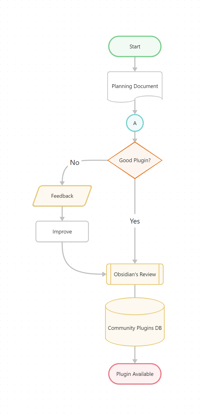
Usage
- Use the updated popup menu set a node's shape
Shapes
Terminal Shape
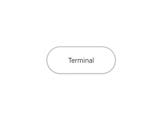
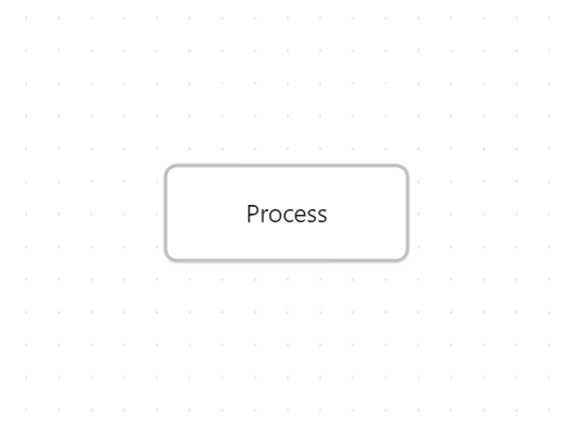
Process/Center Shape
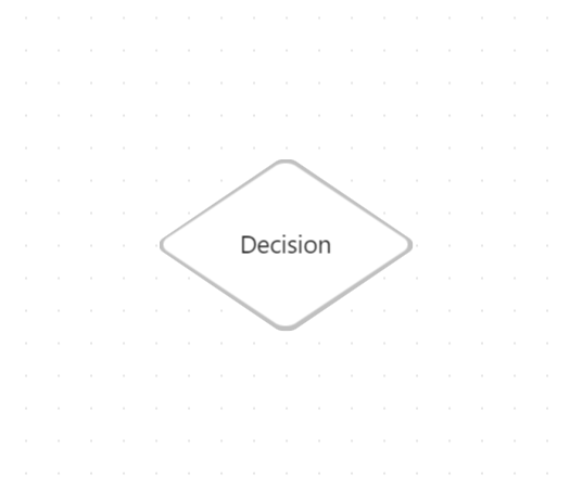
Decision Shape
Input/Output Shape
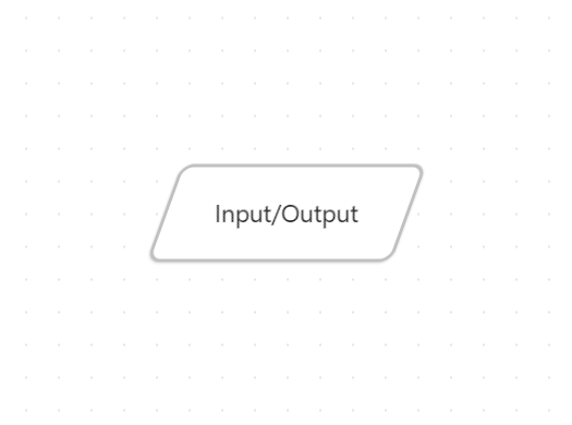
On-page Reference Shape

Predefined Process Shape
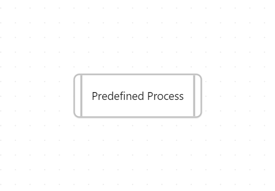
Document Shape
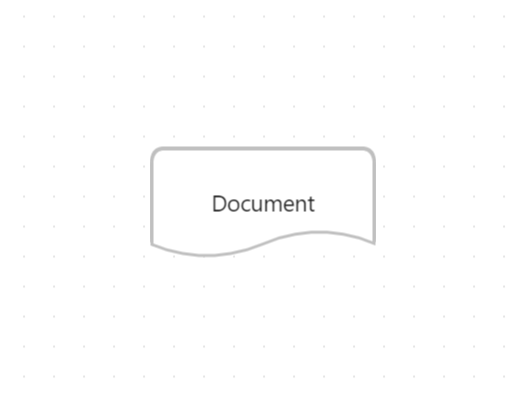
Database Shape
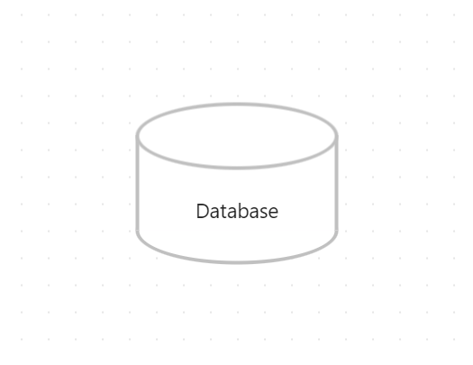
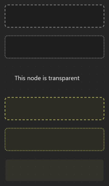
Border Styles
Set the style of the border to dotted, dashed or invisible.
Border Styles Example
Edge Styles
You can customize the default edge styles using the settings.
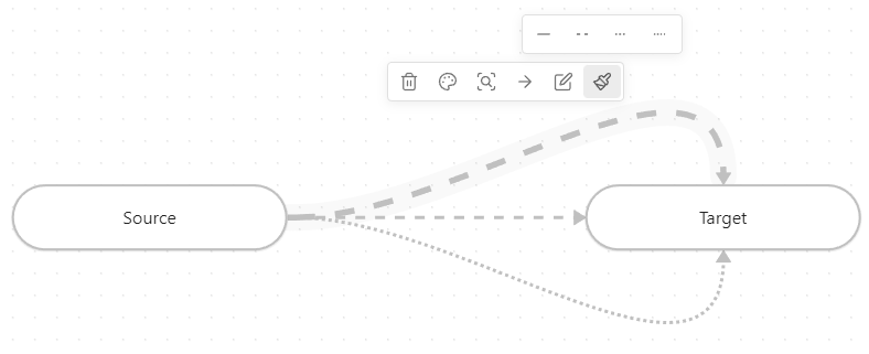
Path Styles
Set the style of the edge paths to dotted, short-dashed or long-dashed.
Edge Styles Example
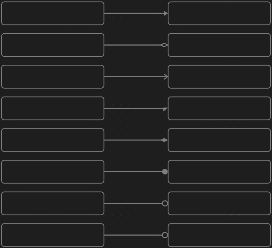
Arrow Styles
Set the style of the arrows to triangle outline, halved triangle, thin triangle, diamond, diamond outline, circle or circle outline.
Arrow Styles Example
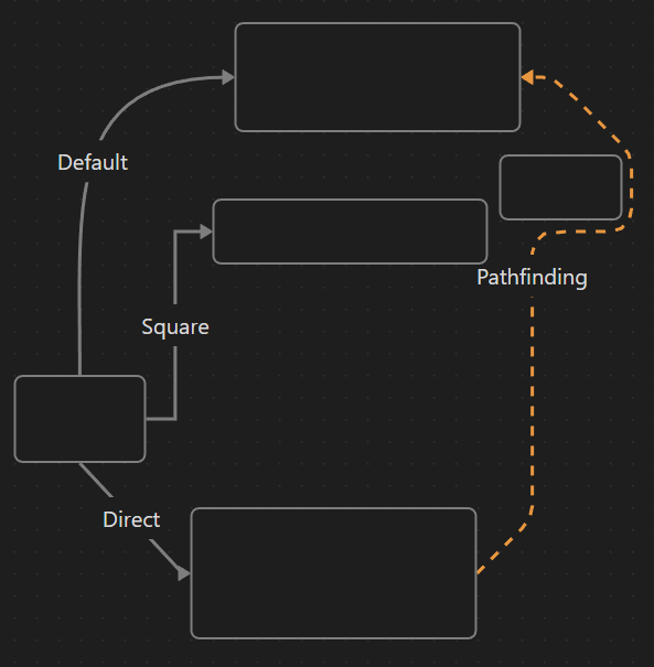
Pathfinding Methods
Set the pathfinding method of the edges (arrows) to default, straight, squared or A*.
Path Styles Example
Custom Styles
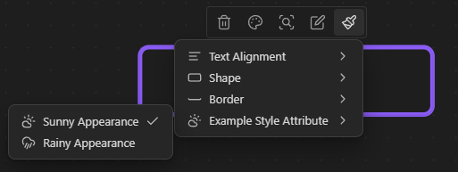
Custom style attributes for nodes and edges can easily be added.
- Add a popup menu option
- Open the
<VAULT-PATH>/.obsidian/plugins/obsidian-advanced-canvas/data.jsonfile - If you want to add an option to node popup menu, search for
customNodeStyleAttributesproperty, otherwise search forcustomEdgeStyleAttributesproperty. (Create it if it doesn't exist yet) - Add the custom popup menu option (Remove the comments!)
"customNodeStyleAttributes": [ { "datasetKey": "exampleStyleAttribute", // Must be unique and written in camelCase "label": "Example Style Attribute", "options": [ { "icon": "cloud-sun", // Choose an icon from lucide.dev "label": "Sunny Appearance", "value": null // Null means default }, { "icon": "cloud-rain-wind", // Choose an icon from lucide.dev "label": "Rainy Appearance", "value": "rainy" // The value that gets set } ] } // You can add more categories here ] - Open the
- Create a new CSS snippet in your vault (And enable it in the settings)
.canvas-node[data-<DATASET-KEY>="rainy"] { /* The dataset key is now written in kebab-case */ background-color: #7f7f7f; } - Reload Obsidian and enjoy your new custom style!
Custom Colors
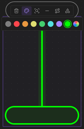
Add custom colors to the color picker. You can add them using the following css snippet:
:root {
    /* Where X is the index of the color in the palette */
    /* The colors 1-6 are already used by Obsidian */
    --canvas-color-X: 0, 255, 0; /* RGB */
}
Custom Colors In Palette
Properties Support
Support for properties in canvas files just like in md files. You can edit the properties using the updated control menu.
Supported properties:
cssclasses(Separate multiple classes with a space)
Custom Background Example (cssclasses)
.canvas-wrapper.<CLASS-NAME> > .canvas-background {
    background-image: url('<IMAGE-URL>');
    background-size: cover;
    background-repeat: no-repeat;
    background-position: center;

    filter: blur(5px) brightness(0.8);
}
Presentation Mode
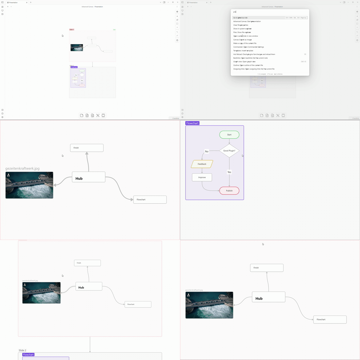
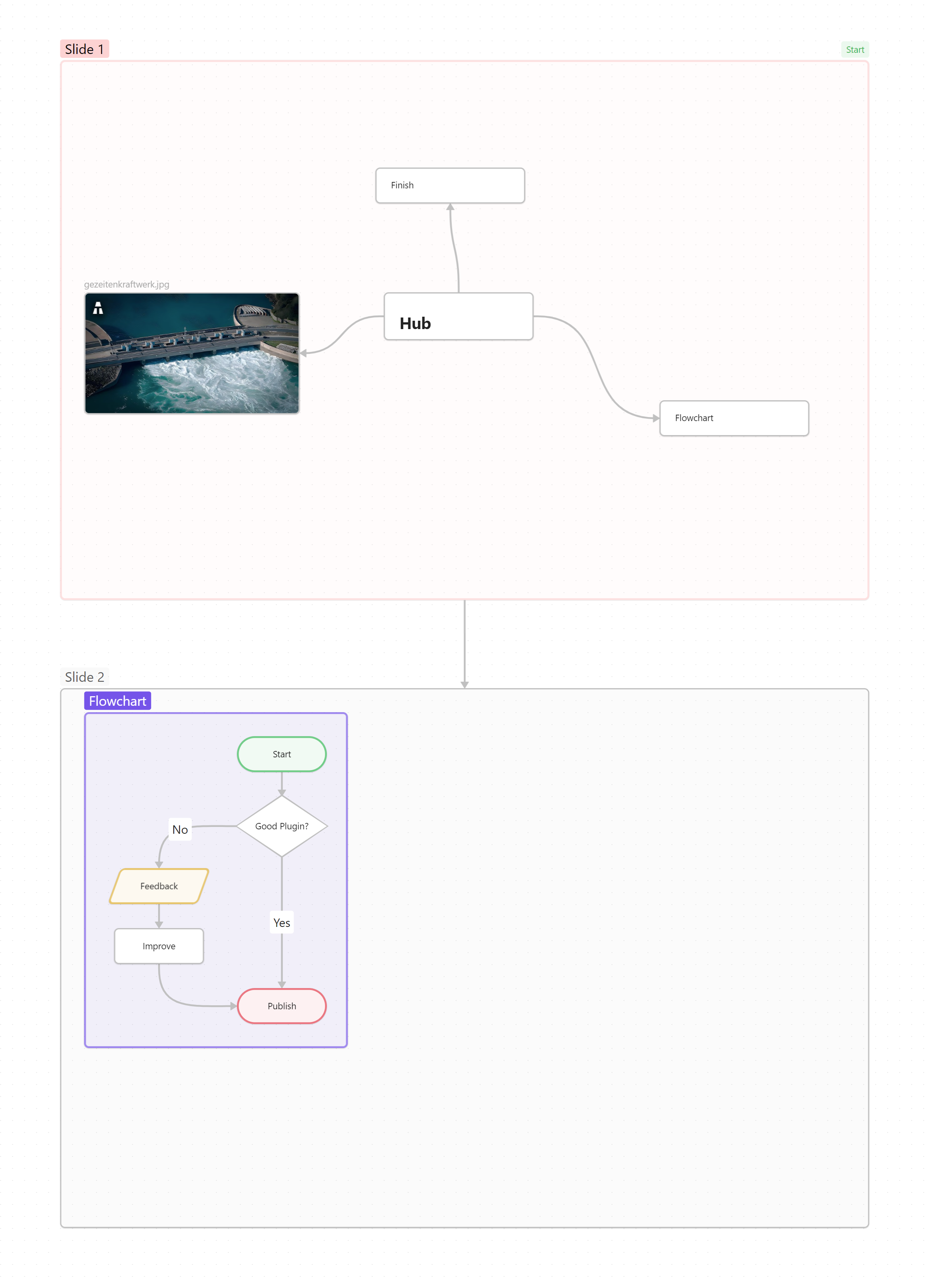
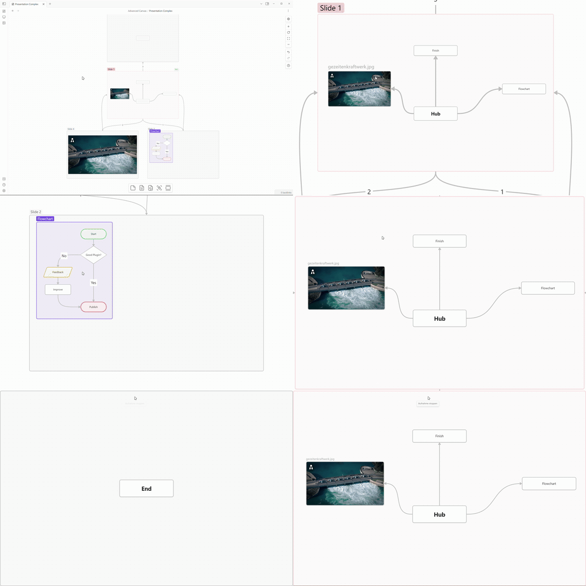
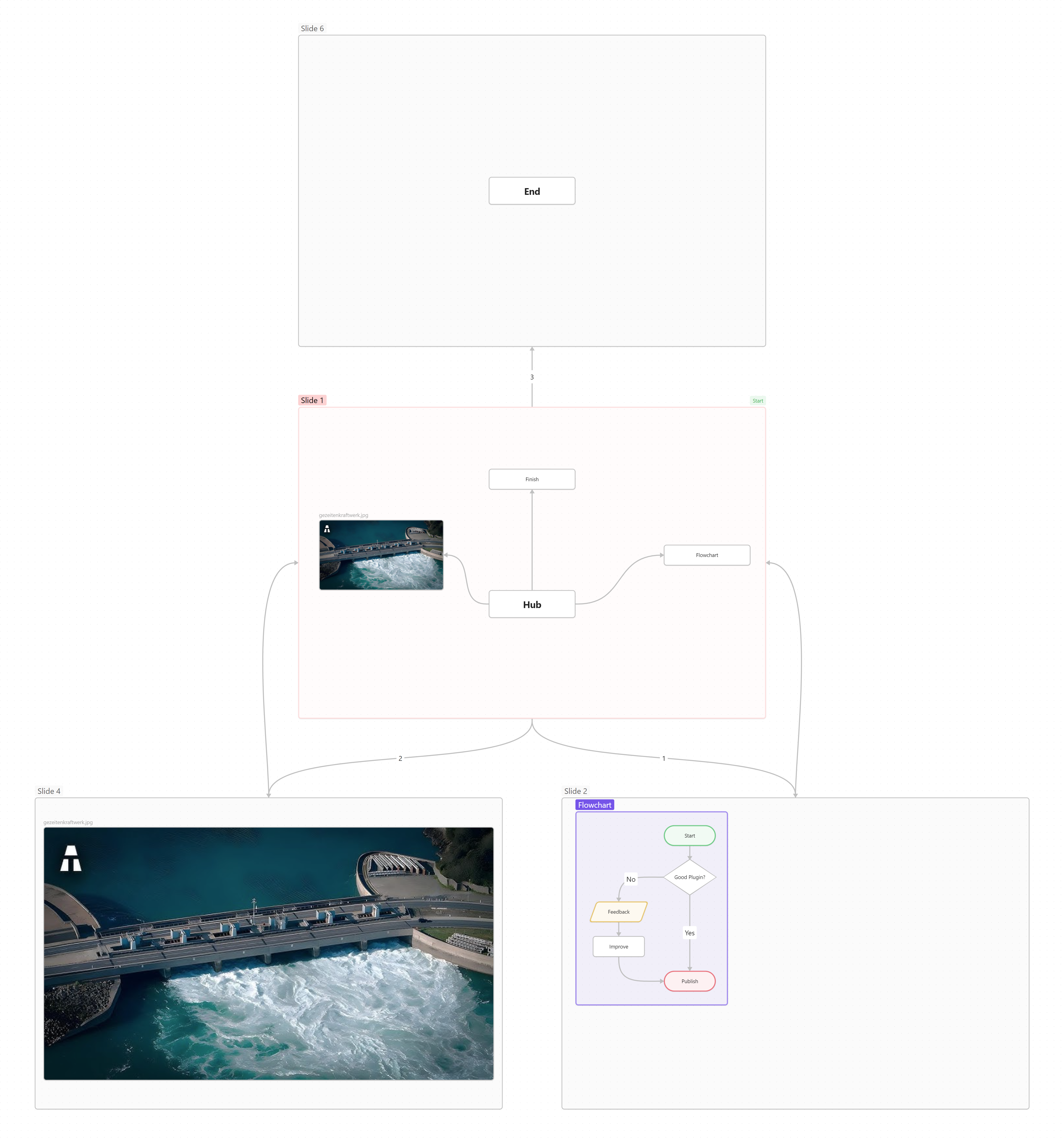
In presentation mode, you can navigate through the nodes using the arrow keys or the PageUp/PageDown keys (Compatible with most presentation remotes). The different slides/nodes are connected using arrows. If you want to have multiple arrows pointing from the same node, you can number them in the order you want to navigate through them. While in presentation mode, the canvas is in readonly mode (So better readonly effects the presentation mode as well!). You can exit the presentation mode using the ESC key or the corresponding command. If you want to continue the presentation from the last slide you were on, you can use the Advanced Canvas: Continue presentation command.
Canvas File
More Complex Example
Canvas File
Usage
- Create the first slide
- Create the first slide of the presentation using the updated popup menu
- OR create a node and mark it as the first slide using the updated card menu
- Add more slides
- Link the slides using arrows
- If you want to loop back to a previous slide, you can number the arrows in the order you want to navigate through them
- TIP: Create slides with consistent dimensions by using the updated card menu
- Link the slides using arrows
- Control the presentation
- Start the presentation using the command palette (
Advanced Canvas: Start presentation) - Change slides using the arrow keys
- Exit the presentation using the
ESCkey
- Start the presentation using the command palette (
Portals
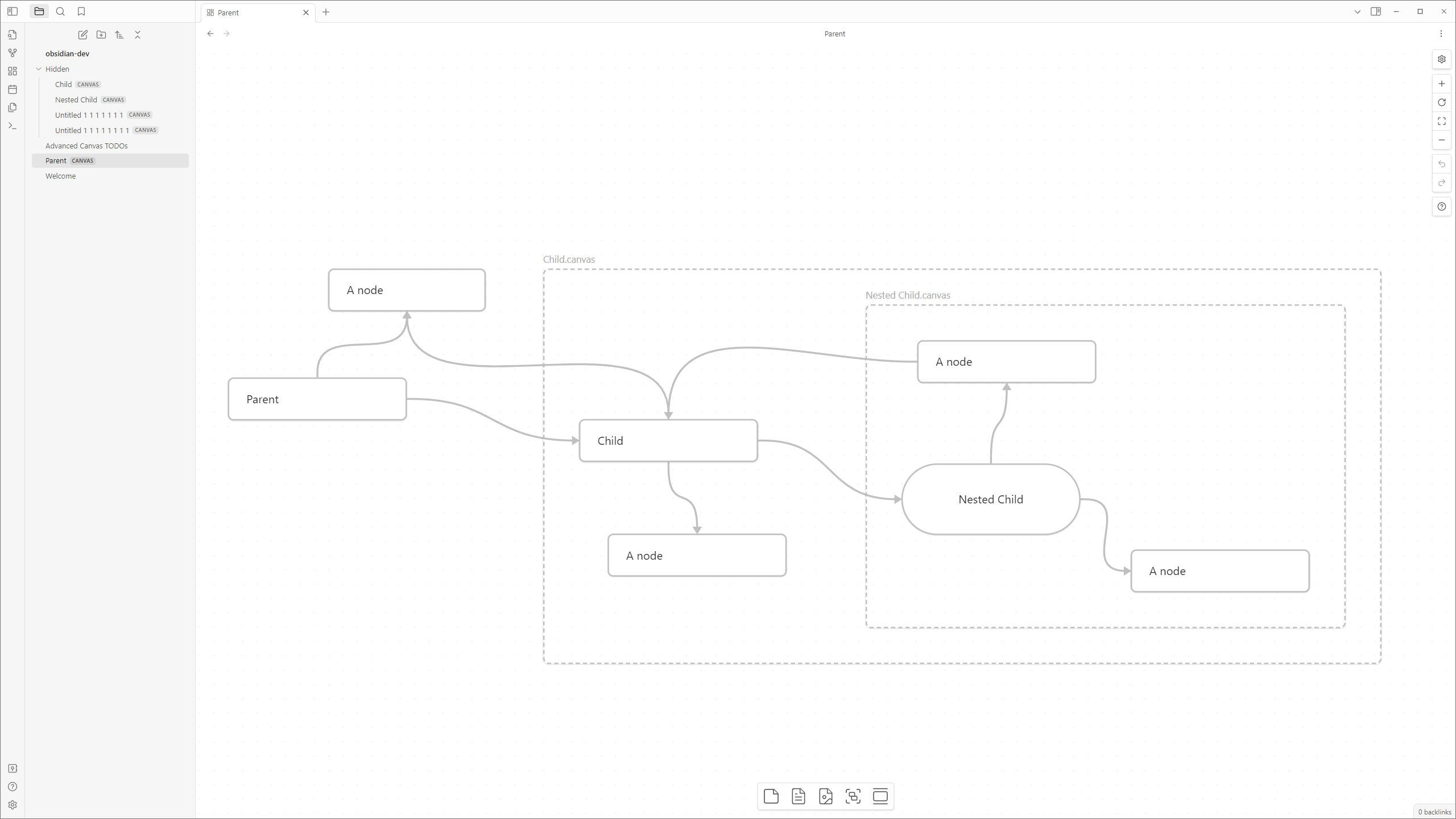
Embed other canvases inside your canvas and create edges (arrows) to the embedded canvas.
Usage
- Embed a canvas file and click on the door icon of the popup menu to open a portal
Collapsible Groups
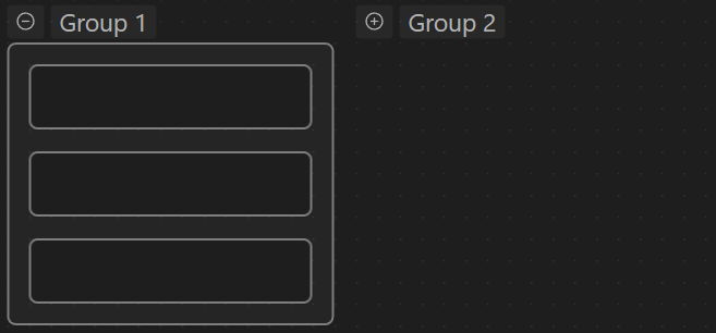
Collapse and expand groups to organize your canvas.
Collapsible Groups Example
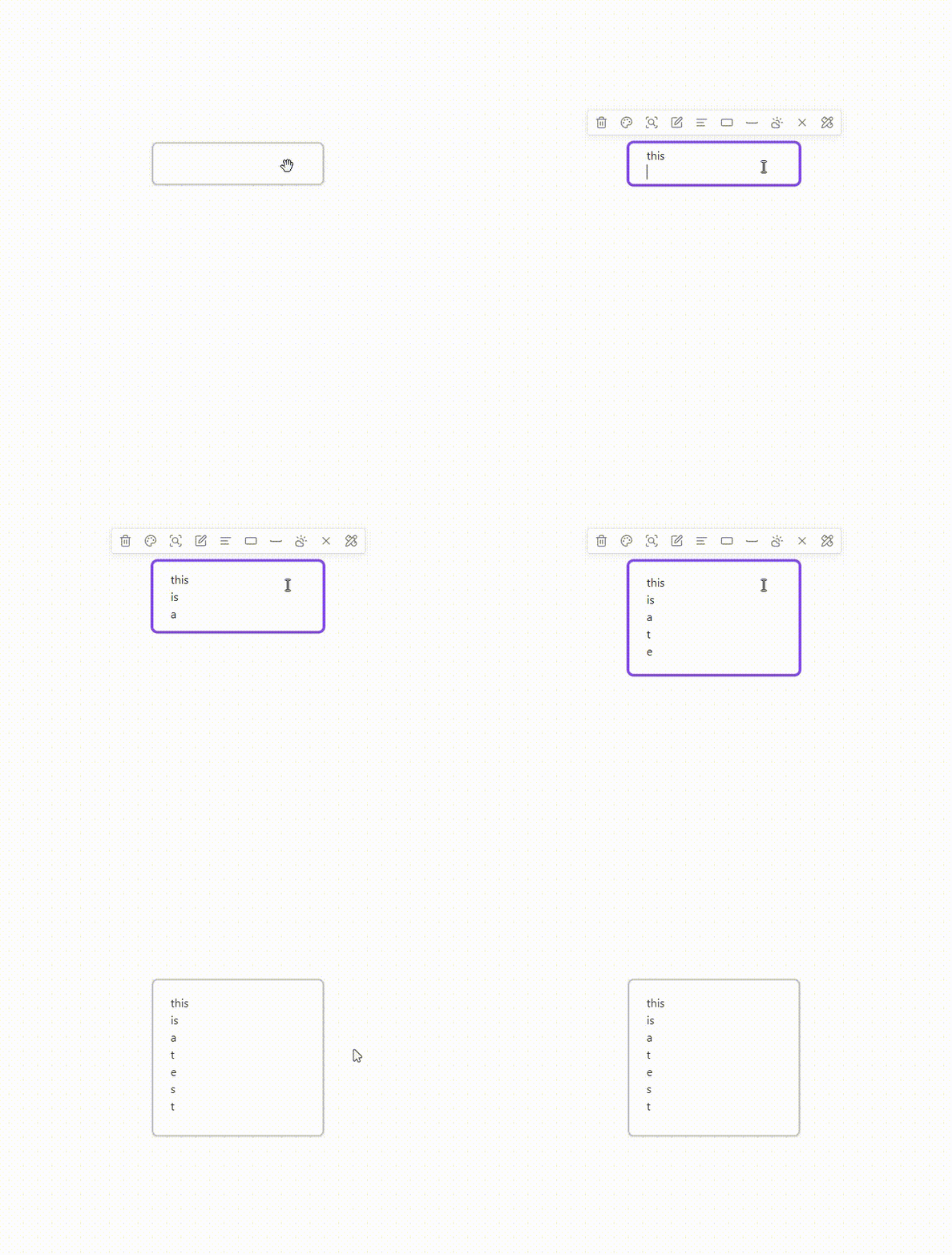
Auto Node Resizing
Resize nodes automatically when the text content changes.
Auto Node Resizing Example
Focus Mode
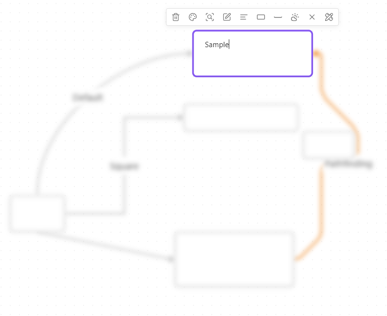
Focus on a single node and blur all other nodes.
Focus Mode Example
Better Readonly
- Disable node popup menus
- Lock the canvas' position
- Lock the canvas' zoom
- BUT to retain some interactivity, it allows zooming to a bounding box (e.g. zoom to selection, zoom to fit all)
Usage
- Use the updated control menu to toggle the new features (Only shown if the canvas is in readonly mode)
Encapsulate Selection
Move the current selection to a new canvas and create a link in the current canvas.
Usage
- Select the nodes you want to encapsulate
- Use the context menu (right click) to encapsulate the selection
- OR use the command palette (
Advanced Canvas: Encapsulate selection)
Canvas Events
All custom events are prefixed with advanced-canvas: and can be listened to using app.workspace.on (Just like the default events).
All Events
advanced-canvas:canvas-changed- Fired when a new canvas gets loaded
- Payload:
Canvas
advanced-canvas:viewport-changed:beforeandadvanced-canvas:viewport-changed:after- Fired before and after the viewport gets changed
- Payload:
Canvas
advanced-canvas:node-moved- Fired when a node gets moved
- Payload:
Canvas,Node
advanced-canvas:double-click- Fired when the canvas gets double-clicked
- Payload:
Canvas,MouseEvent,preventDefault: { value: Boolean }
advanced-canvas:dragging-state-changed- Fired when the dragging state of the canvas changes
- Payload:
Canvas,boolean
advanced-canvas:node-created- Fired when a new node gets created
- Payload:
Canvas,Node
advanced-canvas:edge-created- Fired when a new edge gets created
- Payload:
Canvas,Edge
advanced-canvas:node-added- Fired when a new node gets added
- Payload:
Canvas,Node
advanced-canvas:edge-added- Fired when a new edge gets added
- Payload:
Canvas,Edge - Payload:
Canvas,Edge
advanced-canvas:node-changed- Fired when any node gets changed
- Payload:
Canvas,Node
advanced-canvas:edge-changed- Fired when any edge gets changed
- Payload:
Canvas,Edge
advanced-canvas:node-text-content-changed- Fired when the text content of a node gets changed (While typing)
- Payload:
Canvas,Node,ViewUpdate (From CodeMirror)
advanced-canvas:node-removed- Fired when a node gets removed
- Payload:
Canvas,Node
advanced-canvas:edge-removed- Fired when an edge gets removed
advanced-canvas:copy- Fired when the selection gets copied
- Payload:
Canvas,SelectionData (Reference!)
advanced-canvas:node-bbox-requested- Fired when the bounding box of a node gets requested (e.g. for the edge path or when dragging a group)
- Payload:
Canvas,Node,BBox (Reference!)
advanced-canvas:edge-center-requested- Fired when the center of an edge gets requested (e.g. for the edge label position)
- Payload:
Canvas,Edge,Position (Reference!)
advanced-canvas:containing-nodes-requested- Fired when the nodes inside a bounding box get requested
- Payload:
Canvas,BBox,Node[] (Reference!)
advanced-canvas:selection-changed- Fired when the selection of the canvas changes
- Payload:
Canvas,oldSelection: Set<Node|Edge>,updateSelection: (() => void) => void
advanced-canvas:zoom-to-bbox:beforeandadvanced-canvas:zoom-to-bbox:after- Fired before and after the canvas gets zoomed to a bounding box (e.g. zoom to selection, zoom to fit all)
- Payload:
Canvas,BBox
advanced-canvas:popup-menu-created- Fired when the a node popup menu gets created (Not firing multiple times if it gets moved between nodes of the same type)
- Payload:
Canvas
advanced-canvas:node-interaction- Fired when a node gets hovered over
- Payload:
Canvas,Node
advanced-canvas:undo- Fired when undo gets called
- Payload:
Canvas
advanced-canvas:redo- Fired when redo gets called
- Payload:
Canvas
advanced-canvas:readonly-changed- Fired when the readonly state of the canvas changes
- Payload:
Canvas,boolean
advanced-canvas:data-requested- Fired when the canvas data gets requested
- Payload:
Canvas,CanvasData (Reference!)
advanced-canvas:load-data- Fired when the canvas data gets set
- Payload:
Canvas,CanvasData (Reference!),setData: (CanvasData) => void
advanced-canvas:canvas-saved:beforeandadvanced-canvas:canvas-saved:after- Fired before and after the canvas gets saved
- Payload:
Canvas
Settings
Every feature can be enabled/disabled in the settings. All features were made to be as customizable as possible.
Contributing
All contributions are welcome!
You may want to check out issues with the only PRs label to find issues that won't be worked on by me.
But feel free to work on any issue or non-issue you want to work on!

